The website for Getty Images is currently undergoing a complete redesign. The company is rolling the build out in phases, so only a few pages have been redeveloped so far. It has been a lot of work, but everything is bringing the brand in the right direction.
The Homepage
I really wanted to learn and use something new for the homepage and the design gave me the perfect opportunity to use CSS grid. I worked closely with Leina Leung during prototyping and we came up with a grid that worked across all browser sizes. CSS grid is still not supported by all browsers, so a fallback was written that changes the layout to a grid made of float elements. The only main difference between the protype and production code is @supports was ditched in favor of using a media query specific to IE.
Prototype
The demo is best viewed with the SCSS tab closed and the zoom set to 0.5x or 0.25x.
Production

The Editorial Page
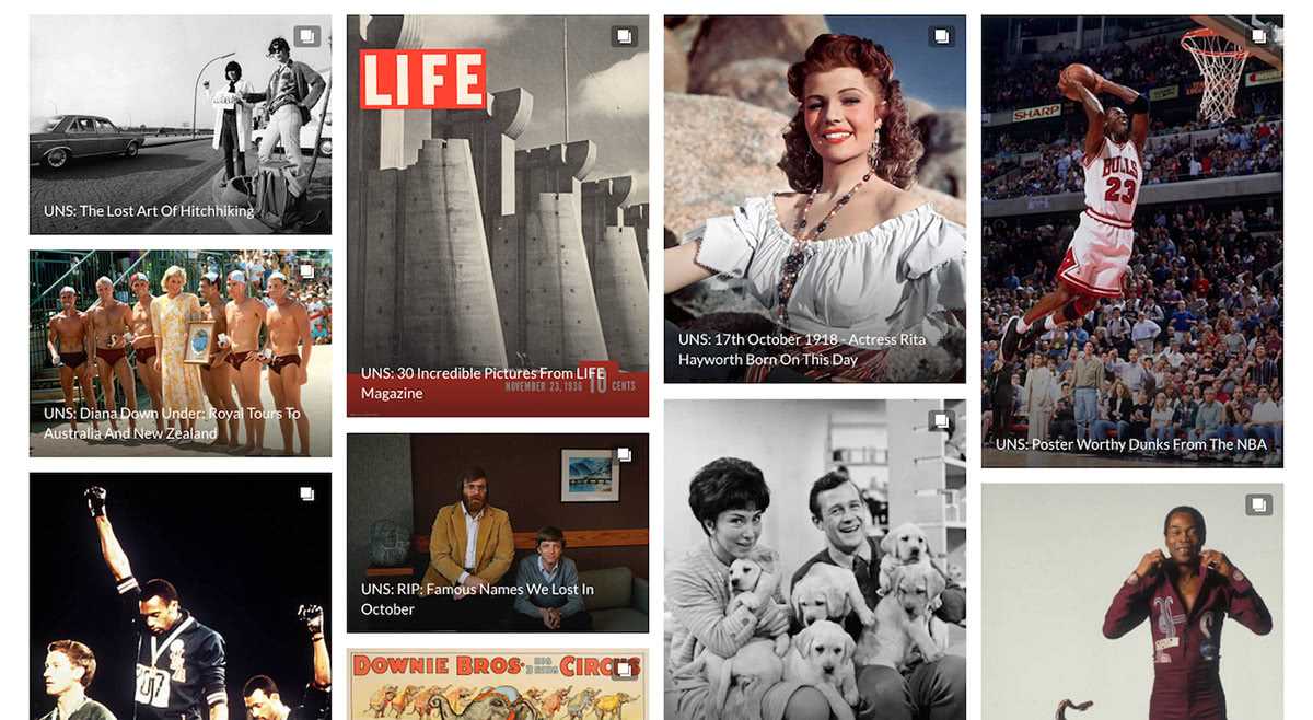
I also got to build the page for editorial images. The page uses a responsive masonry grid to show events in one to five columns depending on the browser size. The individual articles have a linear gradient overlay to make the titles easily readable and an opacity overlay that transitions on hover.

